Tuesday, January 15, 2013
Reflection
Over the course of my study of media, I realized something major; I consume a lot of media. I do not even watch TV very often, and I still find myself consuming media in all different forms at almost any given moment. I might be driving down the street and I could see a billboard, bumper sticker and sign and hear a radio commercial or show all at the same time. Media has become an ever-present factor in our lives, and has and will continue to have an enormous affect on our culture as a whole. I feel that the constant presence of media blurs the line between what I like and want, and what the media is telling me I want as a teenage girl.
After studying media for a few months, I definitely noticed that as I realized the enormity of the amount of media around me, I have begun to analyze almost every form of media being thrown at me. If I see an advertisement or a commercial I automatically start analyzing the target audience, the techniques it uses, and the needs that it appeals to. Then I decide if, based on my knowledge, the marketing campaign will succeed or not. This helps me to reconsider how I receive messages that the media directs towards me. Without the knowledge that I have about media, I would most likely make decisions based more on emotion (i.e. what the media tells me I want or need) rather than take a step back, and make a decision based off of logic.
My media consumption habits have not necessarily changed this semester so much as I have changed the way that I perceive the media that I do consume. I still watch TV shows that use product placement, however I actually notice the product placement and know that they are doing this on purpose to make me buy stuff. At one point I would have seen a Haley Dunphy on Modern Family using Lash Blast mascara, and thought to myself "I wish my eyelashes looked like that." and gone out and bought Lash Blast mascara like the poor media consuming sponge that I was just a few months ago.
Some people are not so fortunate as to be media-literate as I am. As a consumer, this is very dangerous because it becomes very easy for marketers to make them genuinely feel like they need the product and they will use their emotional instincts to make decisions instead of being logical. Even people who are perfectly intelligent find themselves succumbing to the messages of the media without even realize that they are doing so. Without media literacy, consumers are extremely vulnerable to the messages of advertisers. By keeping this log, I have proof that what I just described is true. In my first log, when I was not used to the idea of everything in the media being the way it is for a purpose, I talked about how it irritated me that there was little more information on a billboard besides a phone number, and a picture. Back then, I probably would have called the number. Now I know that the billboard was simply trying to appeal to my need to satisfy curiosity.
Sunday, January 13, 2013
Media #14: McDonald's Veggiburger
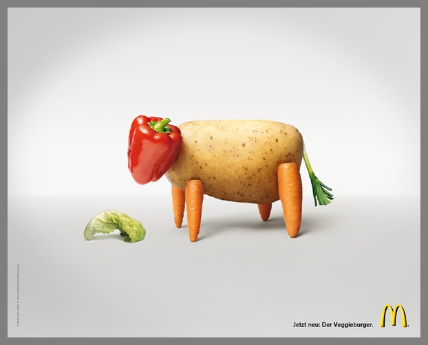
This is an advertisement for the new McDonald's veggiburger. I was rather surprised when I saw the yellow double arches bellow a picture of vegetables because I do not often associate vegetables with McDonald's. Most people who see this ad would most likely agree with me.
McDonalds most likely created this advertisement with the transfer/association technique in mind. Everyone, whether they eat at McDonald's or not associates it with grease, calories, and low quality. This is almost the opposite of what is pictured in the advertisement. This is because they want people to start associating McDonald's with cute animals made out of vegetables.
In my opinion, it is going to take a lot more than a cute animal made out of vegetables for me to stop associating McDonald's with nastiness, which is why this advertisement does not work for me. Despite this, the advertisement is memorable because it is a nice break from the often overwhelming advertisements and commercials because it is so simple.
Media #13: Gucci Resort wear

This advertisement for Gucci really popped out at me because of the surreal quality that is created by the blurring out of everything except for the model who looks like she is day dreaming. Also, all of the colors in the background contrast the red of the model's dress.
This advertisement appeals to peoples' need for prominence, as well as their need for autonomy. The ad appeals to our need for prominence in that the model in focus appears to be at a high class party which we can infer because of what the model is wearing as well as what we can make out of what the surrounding people are wearing. This gives people the impression that If they buy Gucci (a brand already associated with high status) they will be accepted into a world of high class. The ad also appeals to our need for autonomy in that the model is in a crowded place, however she is set apart by what she is wearing. At the same time, she fits in to a lager community, which can also be seen seen as appealing to our need for affiliation.
Some people, if not most would look at the model and say, "Wow, I want to be her," which could convince some people into buying the clothes she is wearing. After seeing the movie, "Missrepresentation", I look at the model and think to myself, "nobody looks that perfect- not even in Gucci!" Because I have been educated on the subject, I know that she has most likely been spray-tanned, caked in makeup, and heavily edited (or she has an eating disorder). For this reason, the advertisement does not convince me to buy Gucci. I think it is extremely depressing that the majority of women and girls will look at the model and hate themselves because they are not glistening with the perfect tan, and not unnaturally facially symmetrical and slender, which in reality is not possible.
Media #12: People sidebars

I subscribe to People magazine, and on every single cover there are pictures and caption on the side of the page that are obviously meant to make people want to read/buy the magazine. In this example, you can see the phrases "new details" and "exclusive!" and "caught in the act" are highlighted in yellow for the purpose of grabbing peoples' attention. They give the impression that People magazine has information that you won't get anywhere else. This appeals to peoples need to satisfy curiosity. To further this appeal, they put pictures above the provocative caption that make you want to turn the page.
Honestly I think that the side bars on People magazine are an effective way to convince people to buy, or at least read the magazine. The need to satisfy curiosity is in my opinion the best need to appeal to because in my case at least, I can't live without knowing Audrey Hepburn's secrets, and what happened with Bethenny's divorce that was so ugly.
My problem with the sidebars of People magazine is that the highlighted phrases are so overused that they don't stand out to possible customers anymore since every single magazine uses them nowadays. But, somehow in combination with the thought provoking pictures above them they succeed in striking the curiosity of their target audience.
Sunday, January 6, 2013
Media #11: Pantene
.JPG)
This is an advertisement for
Pantene Expert hair care collection, which I found in a people magazine- a
magazine often read by women searching for the secret to great hair like
Courtney Cox has. My eye was immediately drawn to the enlarged, and apparently glowing
number 10. I was then naturally curious as to why the number 10 was there so I
read the phrase, “Hair that acts 10 years younger.
Then I saw Courtney Cox, who is infamous for acting younger than she is, and
her lustrous locks in the background and I drew the connection, which made me
laugh. This made me feel better about the product, which I assume is Pantene’s
goal.
My problem with this advertisement
is that it is too wordy. Advertisements like this- for hair products, make-up
etcetera do not really need that much explanation in my opinion- they are what
they are. Maybe a simple phrase like “age defy” or “pro-vitamins and caffeine”
or “expert secret” would do, but this ad put all of this and more into one
small rectangle making my eye jump all over the place when really all I need to
see is Courtney Cox’s hair in order to receive the message.
Courtney Cox’s presence
demonstrates the advertiser’s use of the testimonial technique. This makes
people think that because a celebrity uses Pantene then it must be good. It
also uses the magic ingredient technique in that it talks about and “expert
secret” which Pantene knows about, a can automatically make you look like
Courtney Cox or all of the other celebrities who know “the expert secret.” This
consequently appeals to my need to satisfy curiosity because I want to see what
the “expert secret” is and whether or not it makes me look like Courtney Cox.
Friday, January 4, 2013
Media #10: Verbier St-Bernard

This
is an advertisement from a Metropolitan magazine that I found on the train from
England to France for a ski village called Verbier St. Bernard. The
advertisement’s main technique is the appeal to the need to escape. On the left
side of the advertisement, a situation that no one likes to be in- a traffic
jam of taxis in the snow is shown. This provokes feelings of claustrophobia,
discomfort and stress. Also, the picture quality is blurry, which adds to the
effect. On the right it shows a skier skiing down beautiful open cliffs, which
are covered in an untouched blanket of snow. Because of the openness of the
scene, the right side of the advertisement has the opposite affect from the
left. It provokes feelings of freedom, adventure, and serenity. This is a
perfect example of appealing to ones need to escape the world of traffic and
crowds.
I
think this advertisement is very effective because it is relatable to many
people and draws a contrast which effective conveys the message of the
advertisement- if you stay at Verbier St. Bernard then you will be free from
your monotonous life full of cramped situations and discomfort. Most people can
realte at some level to the image. The only issue with this advertisement is
that it does not say what Verbier St. Bernard is or where one can find out more
about what exactly it is. It simply says “discover all or offers online!”
Saturday, December 29, 2012
Media #9: Sleep Number

This is an advertisement that I found in a Vanity Fair magazine on the last page right next to a wordy interview with a comedian. If you were just scanning the pages, you might mistake this unusually wordy advertisement for an article or interview like the one right next to it. I believe this was done deliberately. My opinion was verified when I looked closer and realized the paragraphs were on "the complete Sleep Number experience" and "You'll only find Sleep Number at a Sleep Number Store"- a completely unnecessary addition to the actual information on the Sleep Number, however it creates more words therefore making the advertisement blend in with the articles around it. You can tell that the advertisers do not want people to actually read the words because they are an extremely light color- they just fill up space.
The advertisement uses the "magic ingredient" marketing technique in that it provides new technology and claims that it has the ability to solve anyone's sleeping troubles. I don't think this technique will be effective enough to make people get up and buy it because their problems will be solved, however it will likely convince people to call the given number for more information assuming the person has sleep troubles.
An aspect of the article that really bothered me as the title; "This is not just a bed." This is pretty much the most cliche that an advertisement could have. Although it may provoke a little bit of curiosity, I really believe that a better title would have captured the interest of more buyers- like an amazing fact or statistic.
Subscribe to:
Posts (Atom)